
The Brief
The requirement was to create a book, box and map as a limited edition series of books featuring the work of Robert E. Howard and his character of Conan the Barbarian. The project required use of screen printing and letterpress. The raw text was provided but the formatting, style and illustration was created. As it was limited edition, we created a book that is displayed inside a handmade box with a map and poem of the universe of Conan. The map is a hand drawn version of the original one included with Robert E. Howard's world of Conan, using screen printing to enable us to print a larger map that would fold down and fit into the box.
The Box
The box was handmade with a 1mm space given around the book so it would be tightly held inside the box without too much movement to damage it. With this space we inserted a ribbon underneath the book and attached to the bottom of the box so the book could be easily pulled upwards and out. The outside of the box was covered in buckram material with the issue number in Roman numerals and series name debossed onto the front using the typeface Jana Thork Bold. On the inside cover of the box is the name of the issue of the book letter-pressed in Baskerville 8pt, so the corresponding book can be placed back into the correct box without any confusion. On the right side of the box is the poem 'Cimmeria' by Robert E. Howard, letter-pressed in Caslon 14pt.
The map and book being removed from the box to show the poem underneath

Internal Layout
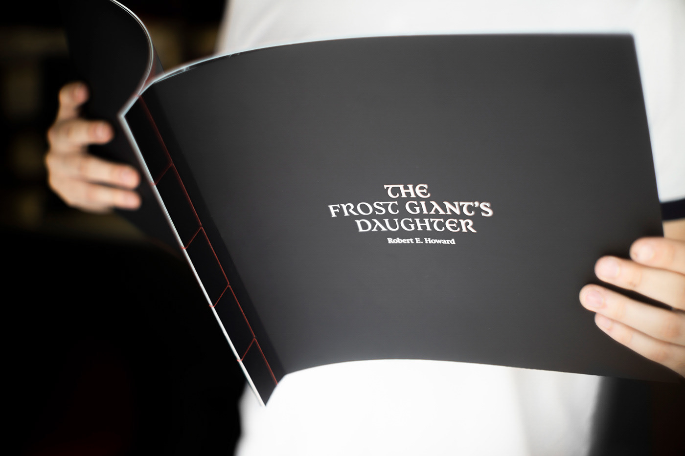
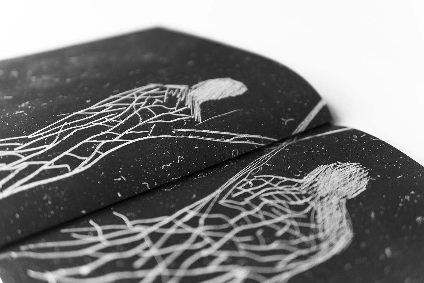
After many experimentations, the final book of 'The Frost Giants Daughter' is printed using the typefaces Swift and Vesta Pro, designed by Gerard Unger, and Jana Thork Bold for the cover. The layout of the text was decided to be in the centre in a square in Swift Regular, with the speech moved out of the grid and changed to Vesta Pro Semibold in a grey colour, or if it was Conan himself speaking, the text would be red. The final illustrations were created through a dry point technique of scratching the drawings into the plastic, then we scanned them in on a film scanner to get the smaller details and the other scratches and dust on the plastic too to give a more 'worked at' and gritty look to them. The book was then bound using Japanese stitching with red thread as the whole colour theme and aesthetic of the book was black and red.

